LAPI
Pinheiros
Creative district
Brand Strategy,
Campaign,
Creative direction,
Environmental design
Pinheiros
Creative district
Brand Strategy,
Campaign,
Creative direction,
Environmental design
About
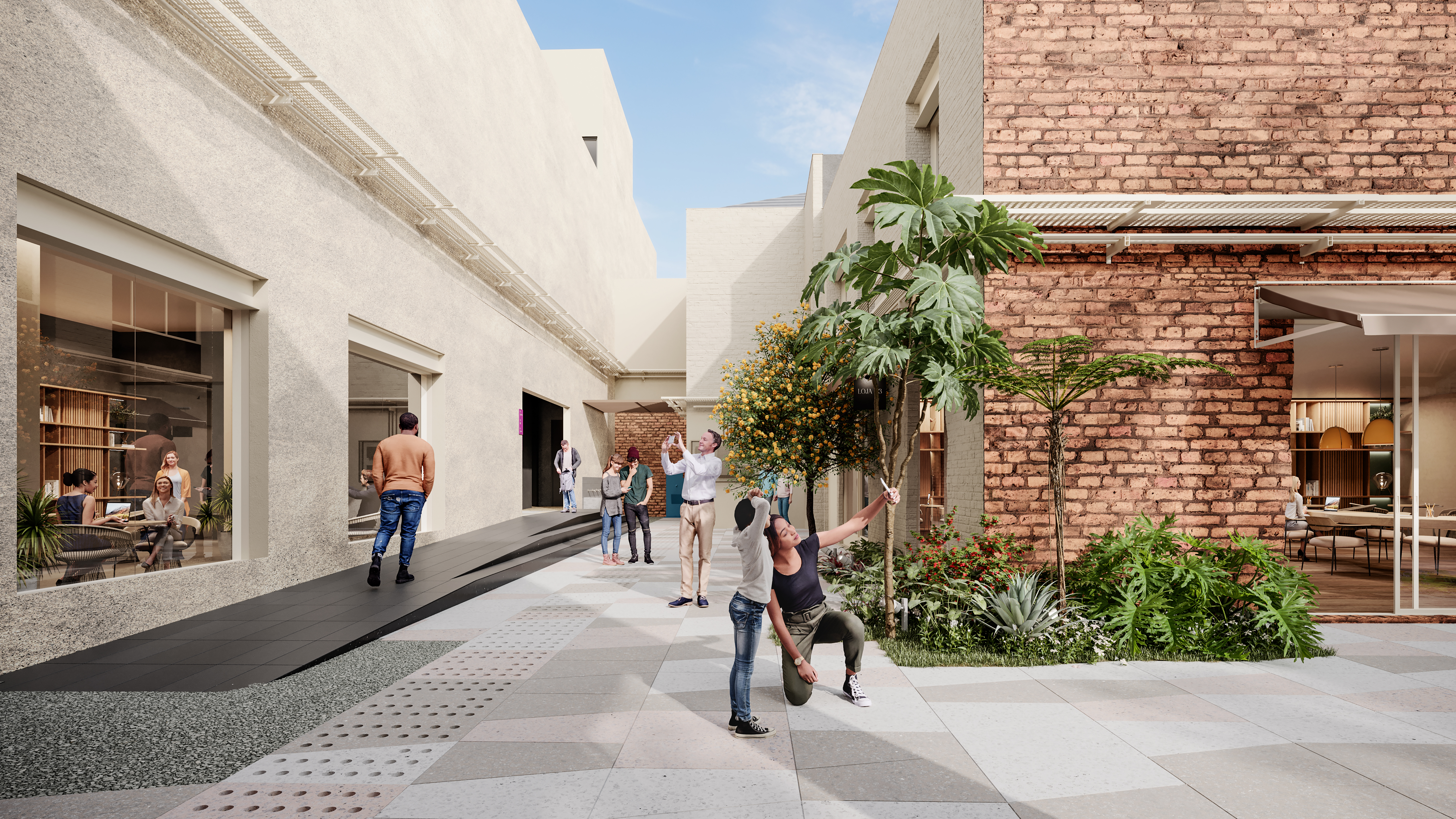
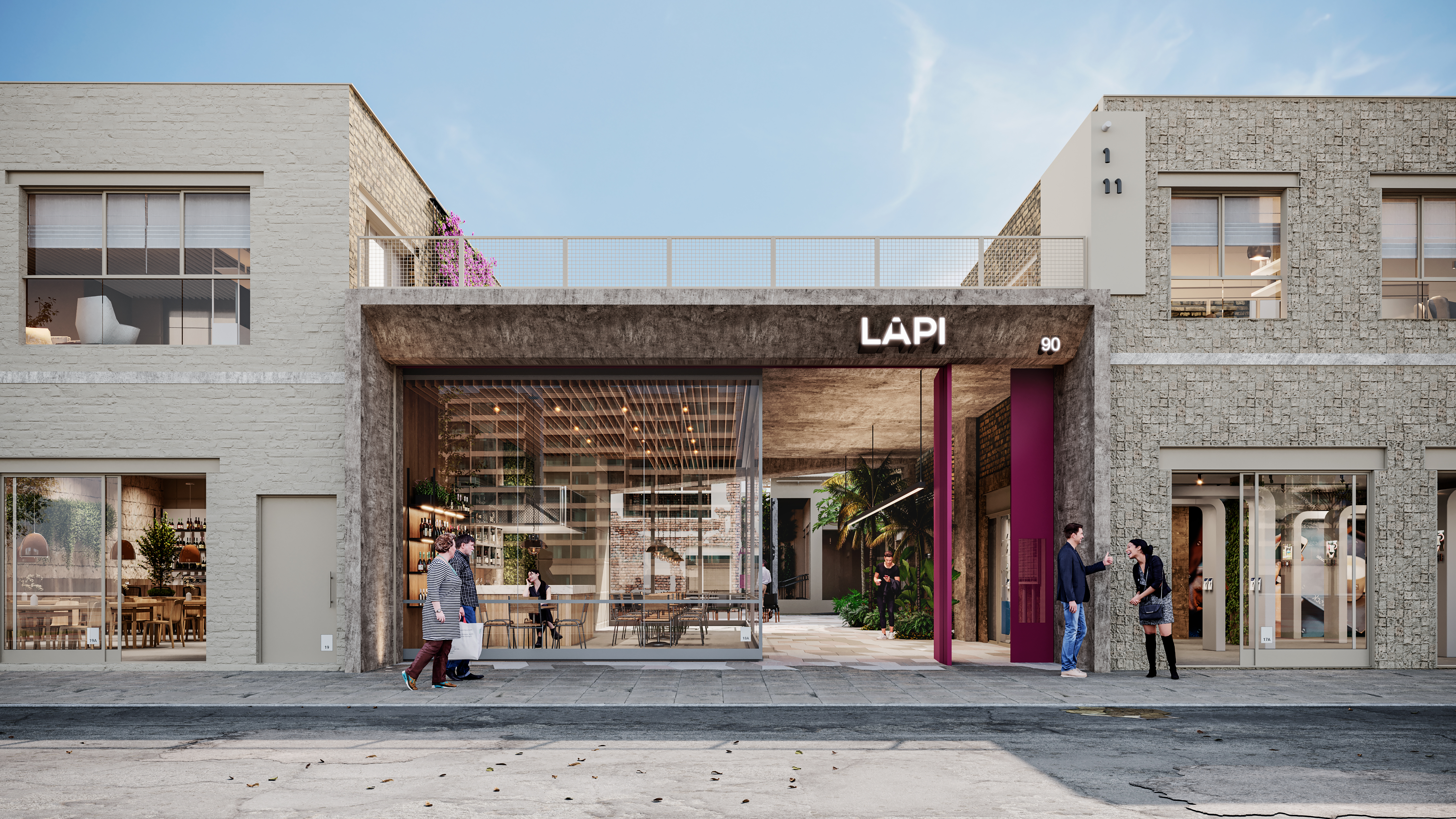
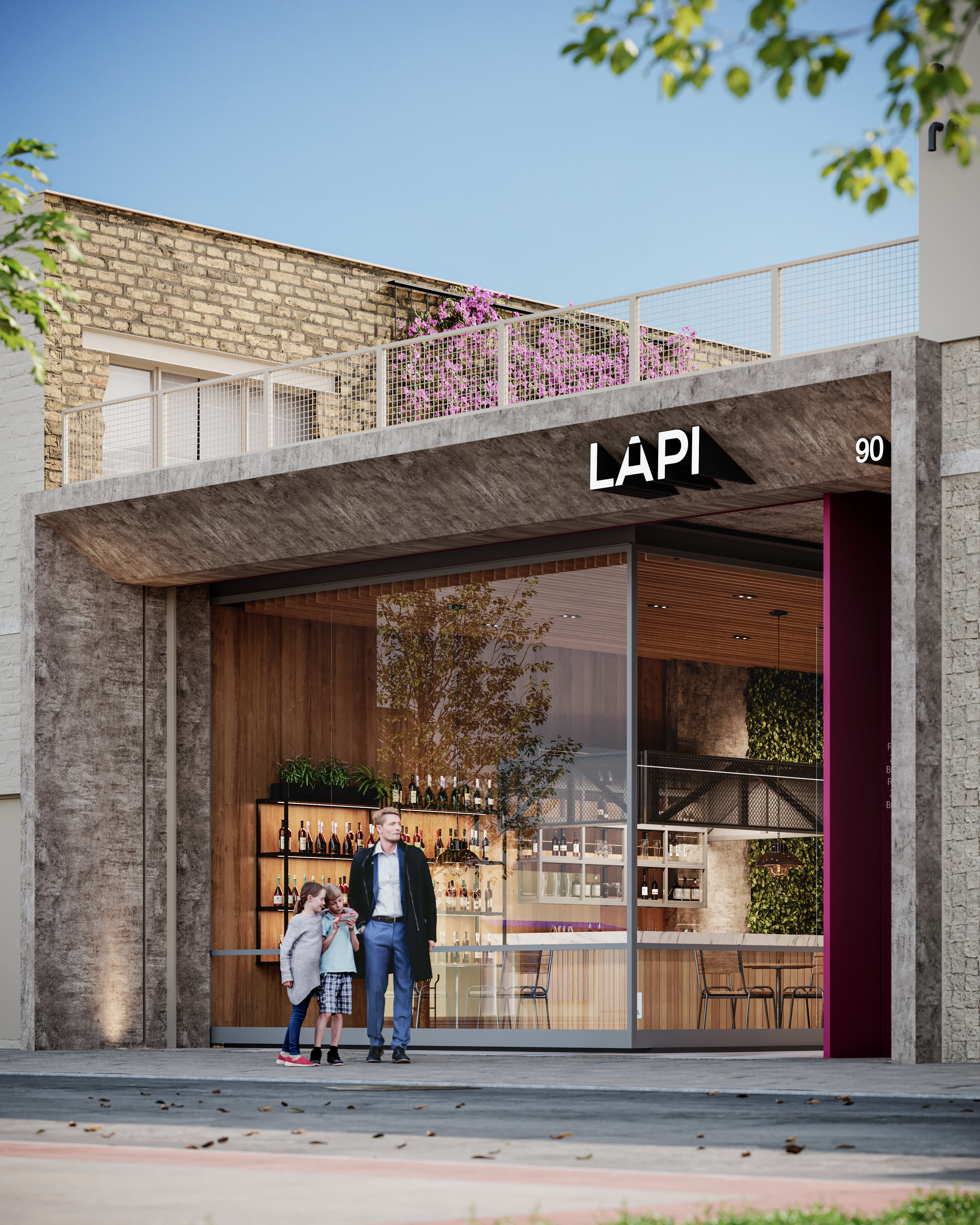
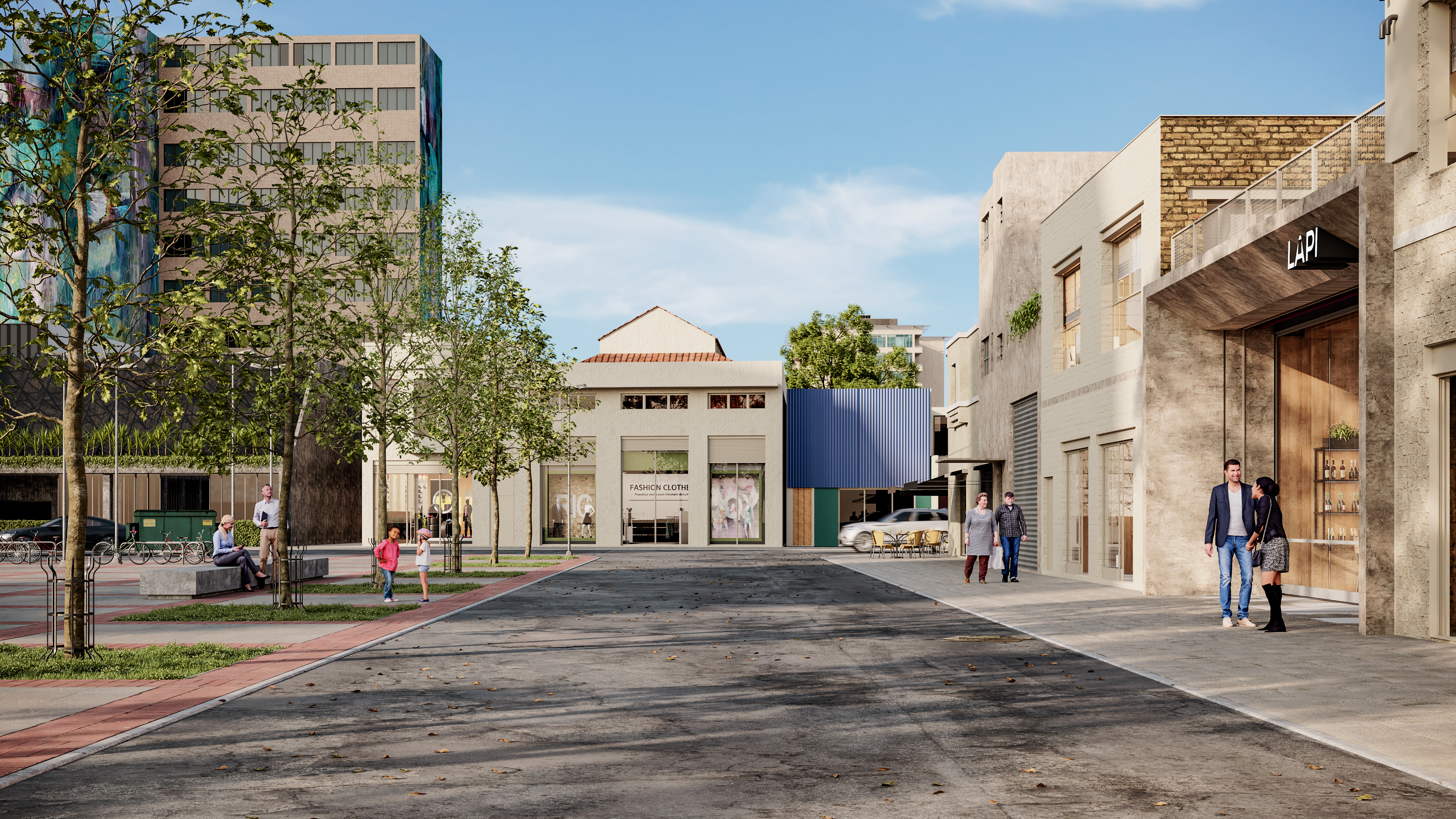
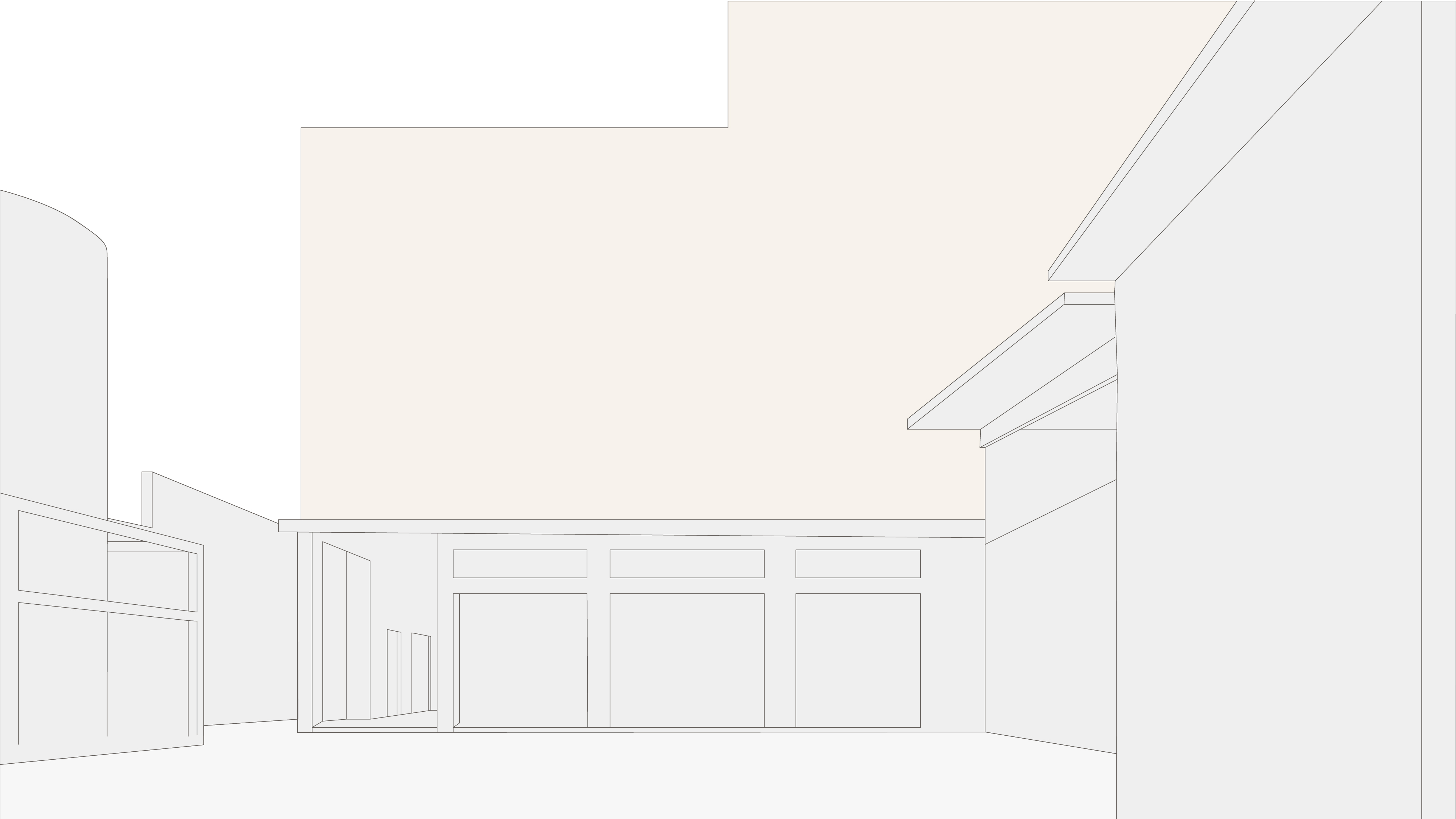
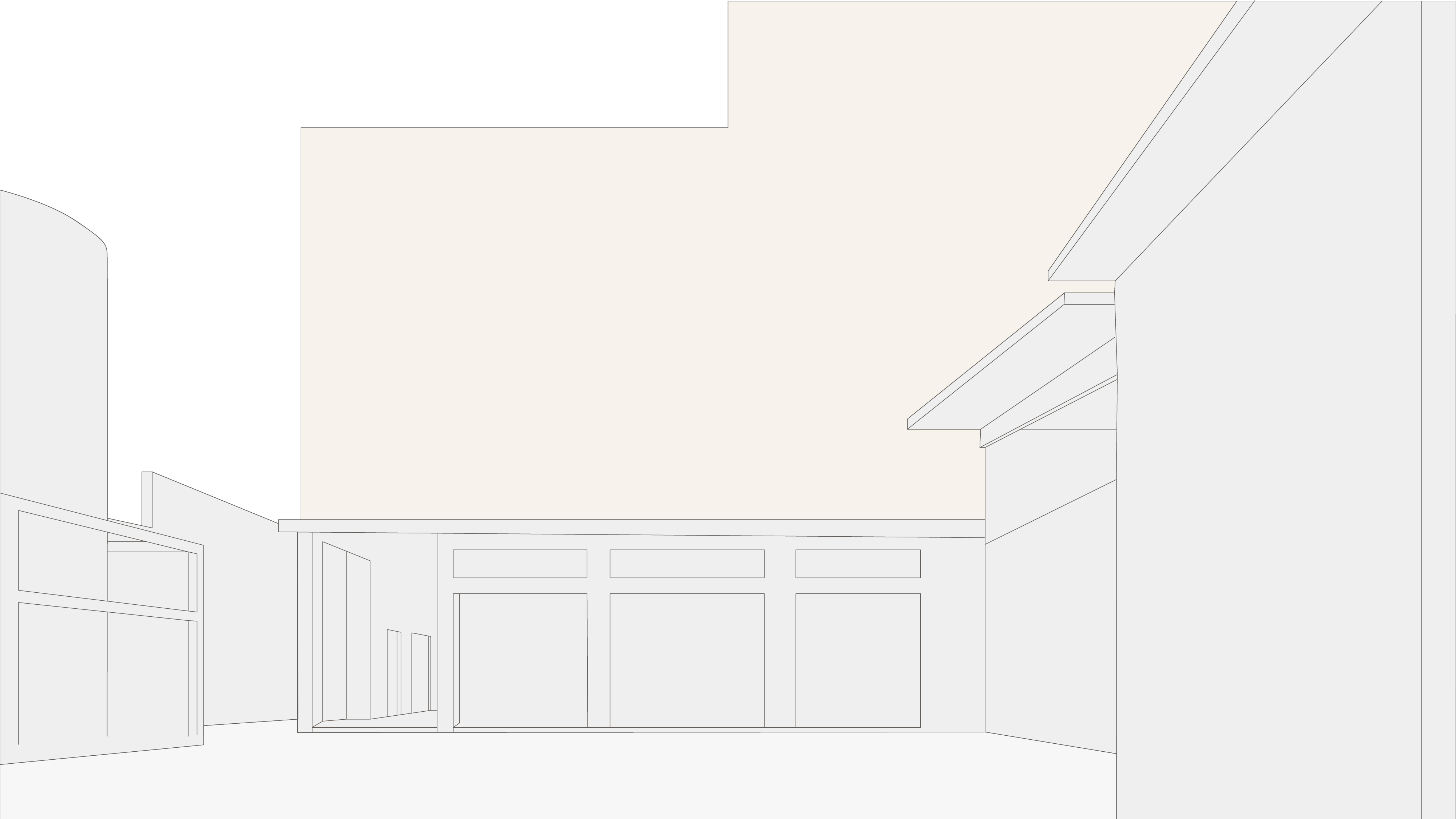
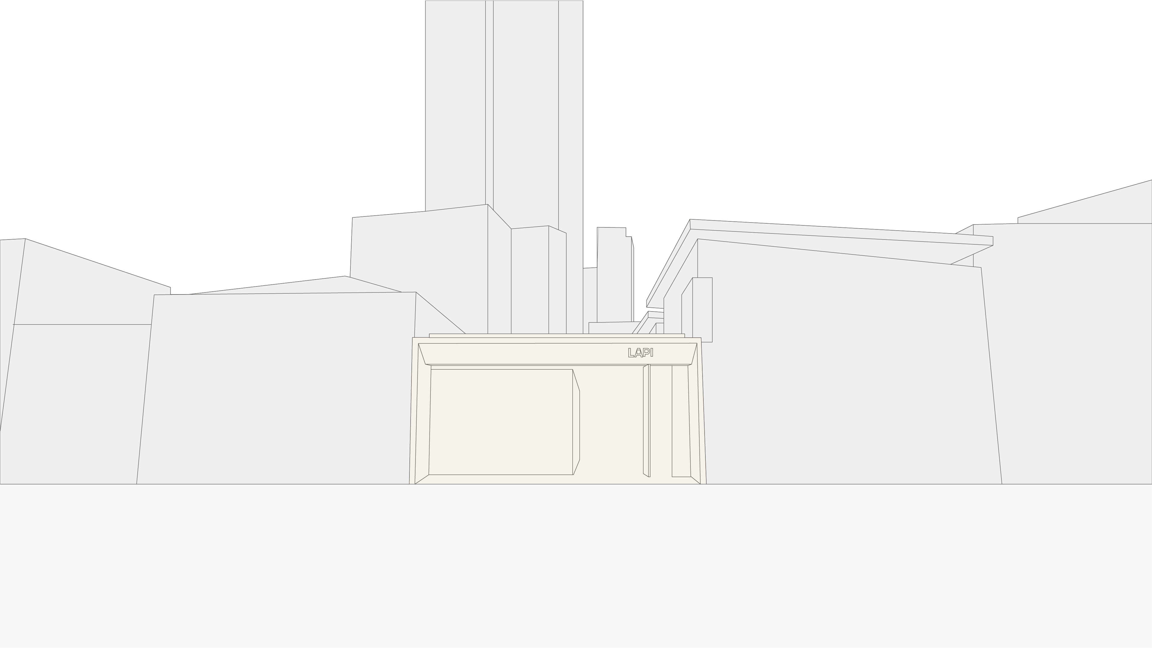
LAPI is a new cultural and commercial hub in Largo de Pinheiros, São Paulo. It is a set of laneways and buildings shared by independent brands in fashion, design, food and culture. The challenge was to give a place with many tenants one clear voice without flattening the variety that makes it worth visiting. The identity treats LAPI less as a venue and more as a piece of the city: a crossing point where people, disciplines and time periods meet.
THE IDEA
The strategy starts from urbanist Nabil Bonduki's view that culture is an active, constitutive part of the city, not decoration added on top of it. LAPI's "new" doesn't come from novelty for its own sake. It comes from encounter: the exchanges that happen in its passages. The concept also works across time, linking the Largo's history to a forward-looking present. That idea runs through the verbal identity:
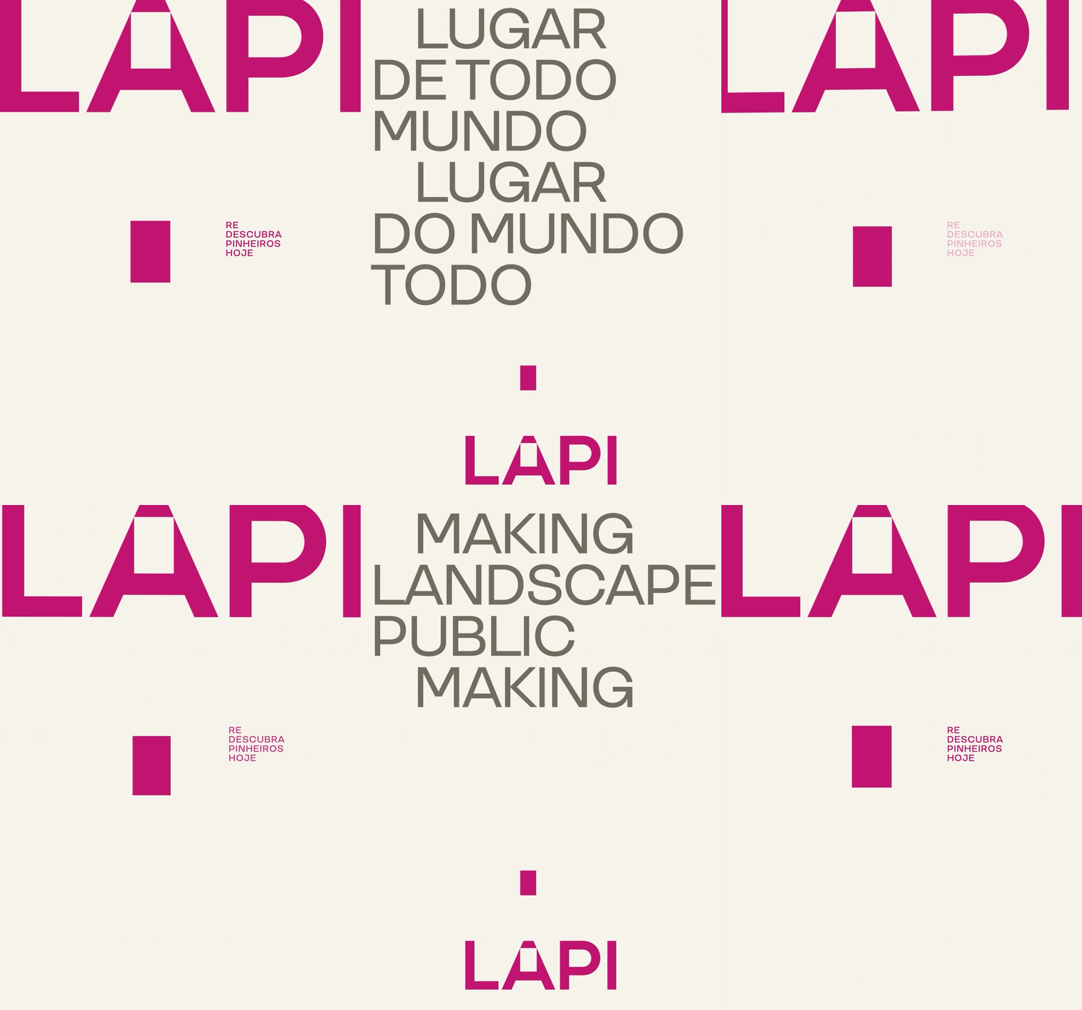
Redescubra Pinheiros hoje (Rediscover Pinheiros today)
Onde a gente se encontra de novo (Where we meet again)
Lugar de todo mundo, lugar do mundo todo (Everyone's place, the whole world's place)
Making landscape public / Making public landscape
THE SYSTEM
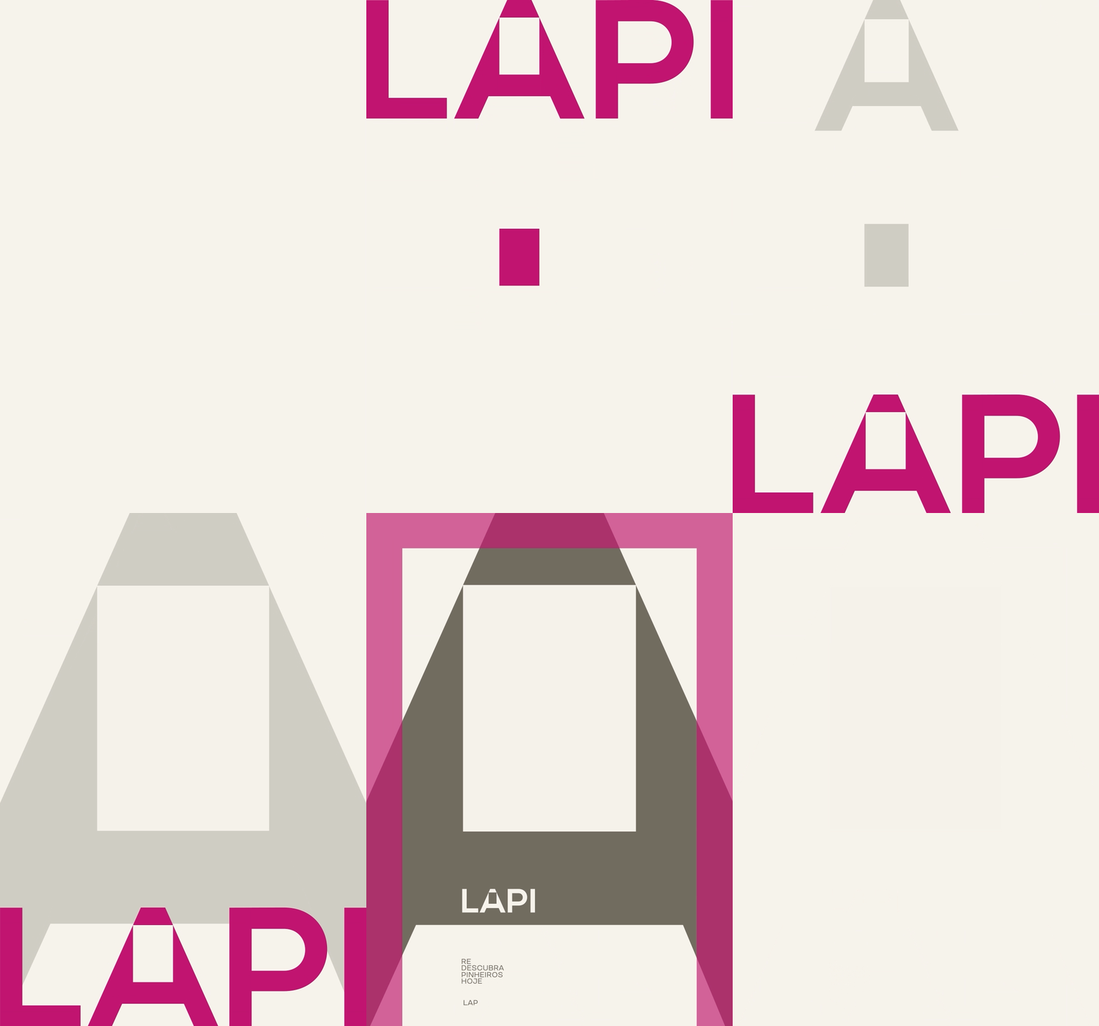
Everything grows from one gesture: the square counter of the A in the wordmark. That square opening stands for space left open for discovery. It is the brand's core asset.
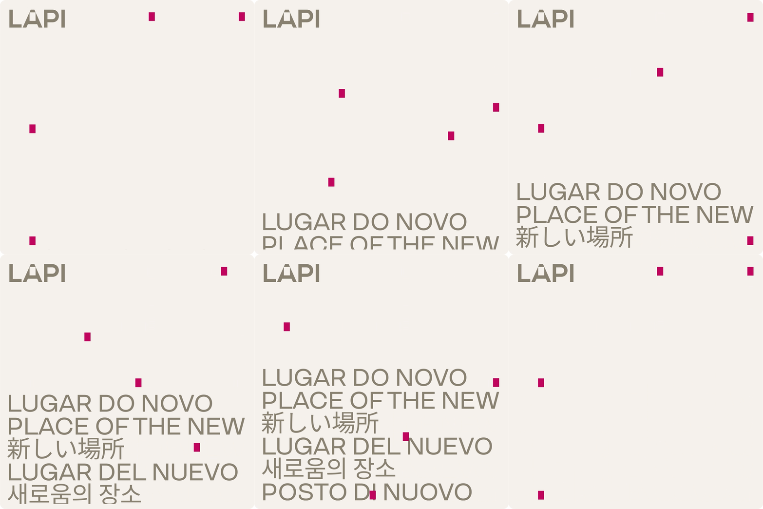
Enlarged, the A becomes a structural frame. Its solid and empty areas organise layouts, and its negative space holds headlines and information. The counter also generates a modular grid of rectangles, which appear as small magenta markers across every piece and work as wayfinding inside the graphic surface.
The palette comes straight from the architecture: Calcário (limestone), Fendi (warm grey-brown) and a single Magenta. They are applied in proportions that follow the building itself, so the brand reads as an extension of the site.
Typography is set in TT Travels with a fixed stylistic set. Uppercase medium weight carries headlines; regular weight carries text.
A proportional grid keeps any format consistent. Margins are calculated from the piece's shortest side, and the remaining area is divided in multiples of two or three. The same logic works on a phone screen and a large-format print.
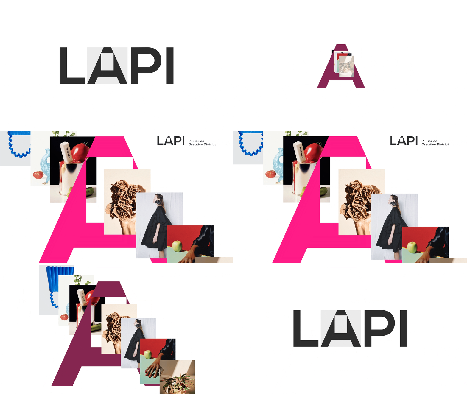
To show the plural, multicultural nature of the occupation, the toolkit adds cut-out forms: colour-filled shapes taken from photographs of the project and its tenants. They can be used as images or as abstract graphics.
IMAGE
Photography follows two axes. Place shows the architecture and how people use it, with priority given to moments of encounter in and around the Largo de Pinheiros and Largo da Batata. Subjects covers the symbolic objects of each discipline on site. Separate rules for still life (clean light, sober backgrounds for cutting out) and scenes (warm natural light, neutral grounds) keep partner content consistent while leaving room for each brand.
CONVERGENCES
The toolkit applies the system to key visuals, Instagram, the website, physical media and the architectural space. Social formats are built around co-presence. Check-in posts list who else is at LAPI, and tenant announcements read "Lo de Lui está aqui" (Lo de Lui is here). A multilingual poster opening with Olha só quem veio (Look who's here) turns the district's openness into typography.
OUTCOMES
The result is a compact, rule-based identity that tenants, partners and LAPI's own team can run without the studio. It is open enough to hold a dozen independent brands under one roof, and specific enough that it could only belong to this place.